- June 30, 2017
- Tero Lunkka
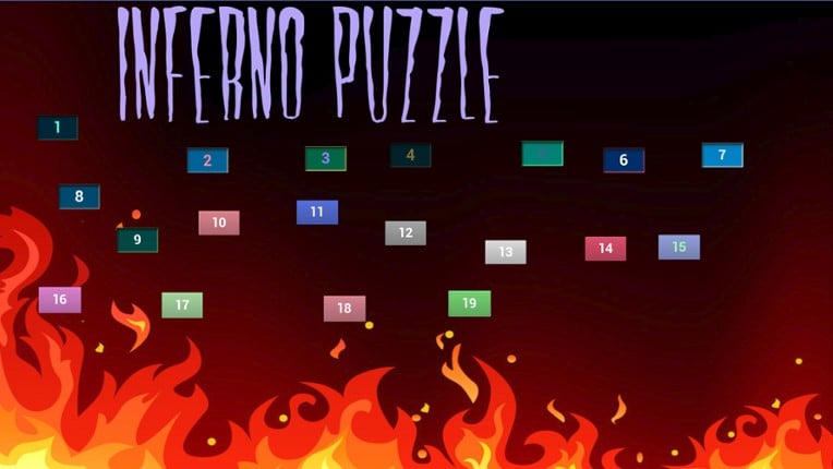
Inferno Puzzle

Platforms
About Inferno Puzzle
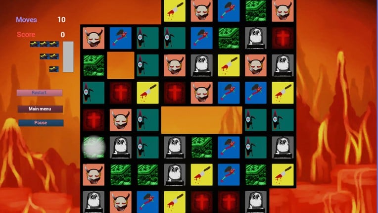
Inferno Puzzle is a single player action game. It was developed by Tero Lunkka and was released on June 30, 2017. It received negative reviews from players.
Simple low poly puzzle game with challenging levels and darker theme
Games Like Inferno Puzzle
Looking for games like Inferno Puzzle? Here are top action recommendations, selected from player-similarity data — start with aMAZE, InfiniPicross or Clergy Splode.


Reviews
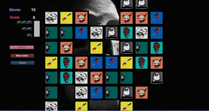
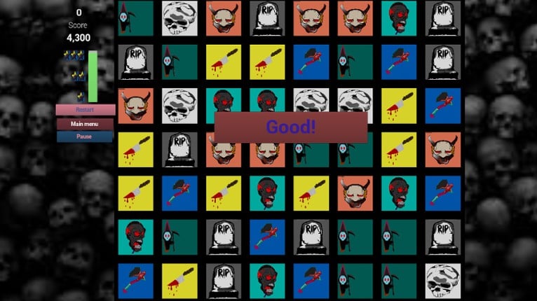
- The game features a unique dark theme that adds an interesting twist to the match-3 genre.
- The sound effects when matching tiles are satisfying and provide a sense of accomplishment.
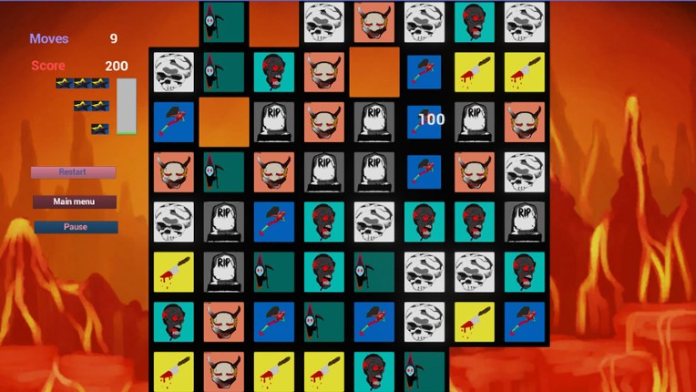
- The concept of having empty tiles on the board introduces a new layer of challenge to the gameplay.
- The graphics are poorly designed, resembling amateur web pages from the 90s, with low-quality assets and inconsistent art styles.
- Gameplay is overly simplistic and lacks challenge, with levels feeling repetitive and unengaging.
- The game is riddled with bugs and lacks basic features like settings, making it feel unpolished and rushed.
graphics
6 mentions Positive Neutral NegativeThe graphics in Inferno Puzzle are widely criticized for being poorly executed, with rough visuals and a lack of cohesion in art styles. Users note the use of generic assets and default buttons, suggesting a need for custom artwork to enhance the overall aesthetic.
“The graphics in Inferno Puzzle are visually striking, showcasing a unique blend of art styles that captivate the player.”
“The icons feature a variety of art styles, adding a distinct flair to the overall visual presentation.”
“Custom artwork for the title screen and desktop icon would enhance the game's visual appeal significantly.”
“The visuals are rough and very poorly made.”
“The graphics are crap though as this is probably just straight up assets.”
“The icons look like they're different art styles taken from different sources; the buttons have no images on them, so they're just the default button.”
Buy Inferno Puzzle

Videos

Frequently Asked Questions
Inferno Puzzle is a action game. Common tags for Inferno Puzzle include indie and match 3.
Inferno Puzzle is available on PC and Windows.
Inferno Puzzle was released on June 30, 2017.
Inferno Puzzle was developed by Tero Lunkka.
Inferno Puzzle has received negative reviews from players. Most players disliked Inferno Puzzle for its graphics.
Inferno Puzzle is a single player game.
Similar games include aMAZE, InfiniPicross, Clergy Splode, Escape This, Wake and others.